VibroBP : An Oscillometric Blood Pressure Monitor
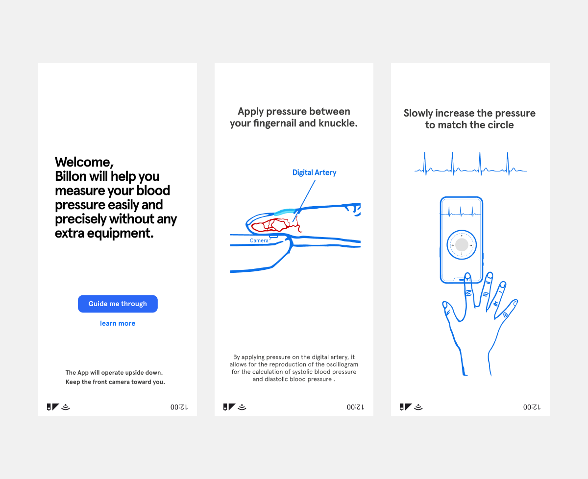
 App
Leveraging the phone’s built-in camera, vibration motor, and motion sensors to measure blood pressure—right at your fingertips.
01
____ What I Did  __
Before
After
How the Technology Works
When a user presses a finger against a vibrating phone screen, the pressure dampens the vibration. The phone measures this damping to estimate applied force. Through the finger’s thin tissue, the camera captures both the pulse and the point where pressure restricts blood flow. Using standard oscillometric calculations, blood pressure is then determined from these pulse measurements.
The paper, “Oscillometric blood pressure measurements on smartphones using vibrometric force estimation,”
02
____ Why I Did it__

Context

The Billion Labs is an innovative very early-stage startup, I collaborated closely with CEO and CTO who developed the technology and other two amazing team members. At the initial stage, this Blood Pressure Monitor works only with detailed In-person guidance, since the method requires many nuance and settings to make sure the users do blood pressure measuring correctly.
To make the technology more applicable, the problem is : how do we develop a digital app to enable user do the blood pressure measurement correctly on their own.
My role was to design the mobile product from the ground up—starting with a blank Figma file and working with cutting-edge technology. This case study focuses on interaction design and user flow, with a focus on building a functional UX prototype of an MVP.
Team
CEO
CTO
UX Designer - Myself
UX Researcher Intern
Engineer

Timeline
Joined in April 2019
Feature release in January 2020
03
____

Overall Goal

Create an onboarding experience that guides users to take precise measurements without in-person guidance, meeting FDA standards for medical monitoring apps.
Constraints:
Can’t Provide Real-Time Feedback:

The system can’t correct mistakes as they happen, unlike in-person guidance.
Sensitive to Nuance:
Many specific settings are required, and small user errors can lead to inaccurate results.
Require Hands-Free Process:
Users can’t interact with the phone during calibration and measurement, as both hands are occupied.
____ Sprint I ____

Objective

Build a rapid design prototype to identify key challenges and learn.

Video Tutorial: Participants forget what the video demonstrated beforehand, so they fail to measure the blood pressure correctly
Photos for Steps by Steps In-Context Guidance
However, photos can't showcase the essential instruction details. I also found the original prototype is difficult to perform measurements with. The ball-matching interaction design tempts users to lift their fingers to adjust ball displacement, but once users reduce applied pressure, it leads to failed results.

Result

Established Design Principles

  • Provide In-Context Guidance:
    Use perspective views to better communicate how finger force is applied,
  • Emulate In-Person Instruction: 

    Explain how the technology works so users can understand why specific details are required. Highlight both correct and incorrect actions step-by-step.
  • Simplify the Measurement Interaction:
    Allow users to focus on gradually increasing the finger's pressure, not manipulating ball displacement.
____ Sprint II ____

Objective

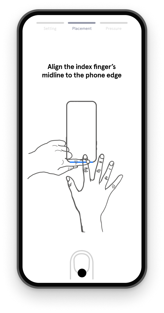
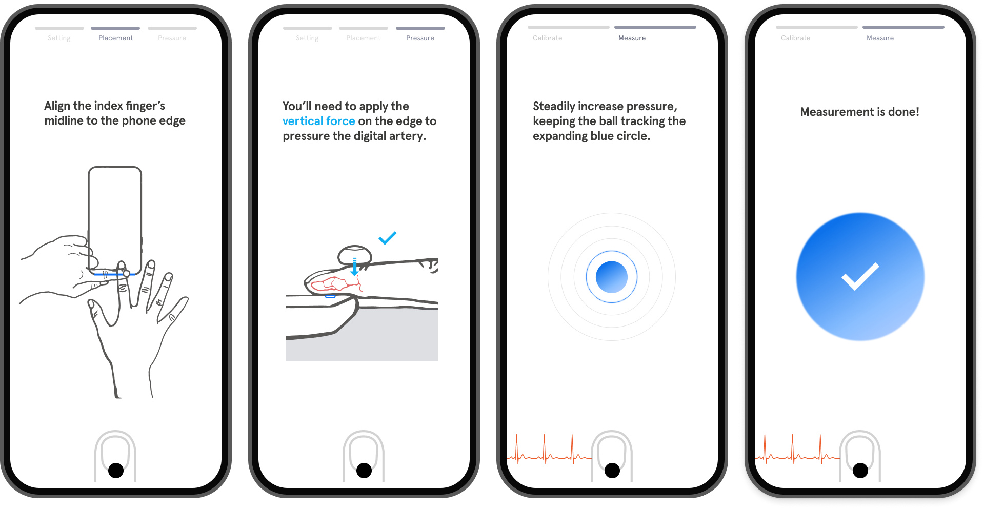
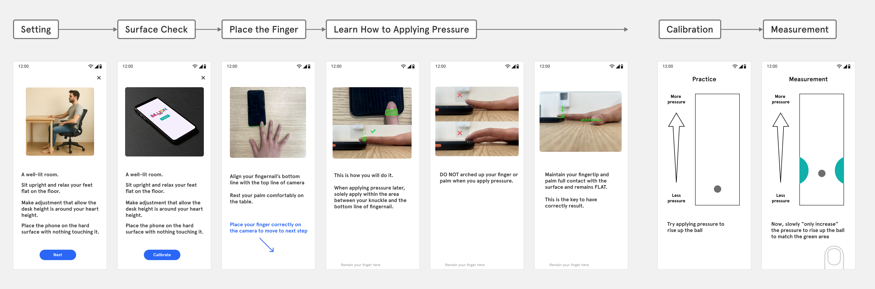
Design a complete first-run experience for prototyping and user testing.

Welcome Screens : Help users understand the tech behind.
Finger Placement: I created illustrations to show the nuances.
The instruction will auto-play.
Learn how to apply pressure: Highlight common mistakes since there's no real-time feedback to guide users.
Measuring: The new interaction design removes the moving ball factor, allowing users to focus solely on increasing pressure to expand the gray area. When it matches the dashed circle, the outline will flash green, then show the next dashed circle until the measurement is complete.

Findings

Users followed instructions but often measured incorrectly

Result

Discover a Simplified Measurement Method

Adding a second finger on top helps apply pressure more effectively This also reducing human factor challenges and simplifying the instructional process.
____ Sprint III ____

Objective

User can successfully follow through the instructions in FRE

Welcome Screens: Less text explanation, more visual communication
Finger Placement: The new method prevents common errors like an arched palm, so less text is needed.
Learn how to apply pressure : Add side views and explain how the technology works to help users understand why specific details —like vertical force and full contact with the camera—are essential, making them more likely to follow the instructions.
Practice Mode + Perform Measurement : We learned that users feel disrupted when measurement starts suddenly. Adding countdown screens helps them feel prepared and prevents this disruption. Moreover, unlike the previous design, the concentric circles guide users to maintain pressure until the ball reaches the outermost ring.

Result

Most users can follow the instruction and do it correctly!

Next : Collect more data to prove the accuracy of measuring.
04
____

Goal

Build an interactive demo app for pitch attendees to experience the advanced blood pressure technology.

Design an Efficient Everyday Flow for Returning Users

However, this experience still need to feel coherent with the onboarding flow—supporting both engineering simplicity and established interaction patterns.
  • Making the Experience Concise yet Informative
    The everyday flow shorten finger placement guidance from onboarding and utilizes countdown screens to prompt proper pressure application.
  • Refining the Pre-Measurement Experience as Calibration
    Familiar users perceived Practice Mode as unnecessary, so we clarified that it functions as the calibration step before measurement to improve clarity.
Calibration flow for returning users

Craft a Smoother Experience for Demo App

I used usability heuristics to evaluate the previous design and enhance the overall experience, with emphasis on flexibility and efficiency of use (navigation),  visibility of system status (progress bar and steps), real-world alignment (matching the red circle to measuring blood pressure) , error prevention, and recognition rather than recall ( step by step in-context guide).
05
____
The demo app was created to showcase this advanced technology and make it accessible for broader, more effective demonstrations. It enabled the CEO to present the solution to high-impact stakeholders, including Google’s Health Technologies group and government institutions. Through the dedication and collaboration of the entire team, the project was honored with the Special Recognition Norman Design Award and received funding from the National Institutes of Health (NIH). I’m truly proud to have been part of this meaningful work!


Next Steps
To support FDA approval, the company is collecting data and using NIH grant funding for validation and usability studies. Visual design will begin after regulatory clearance is secured.