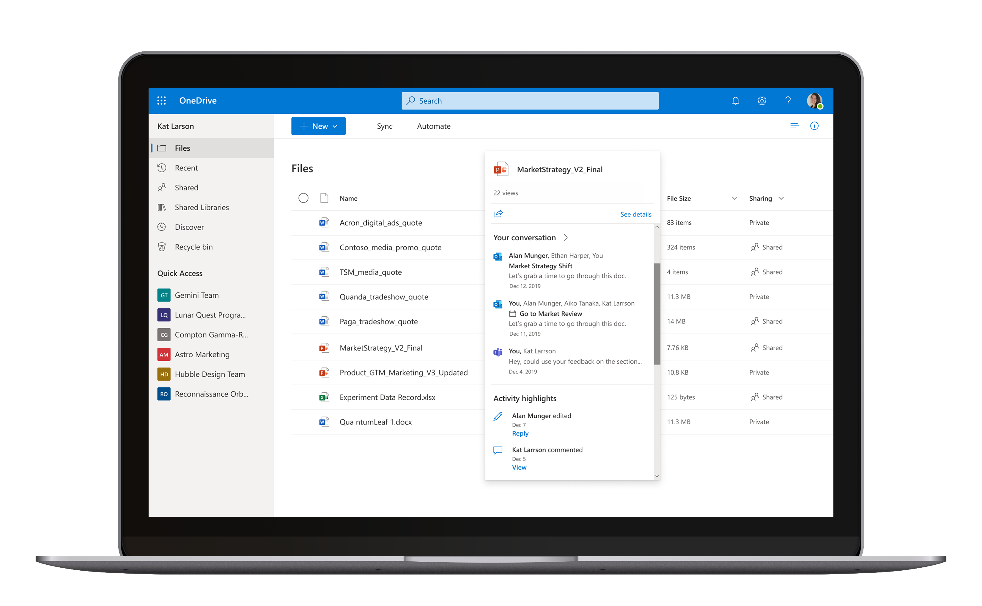
File Hover Card
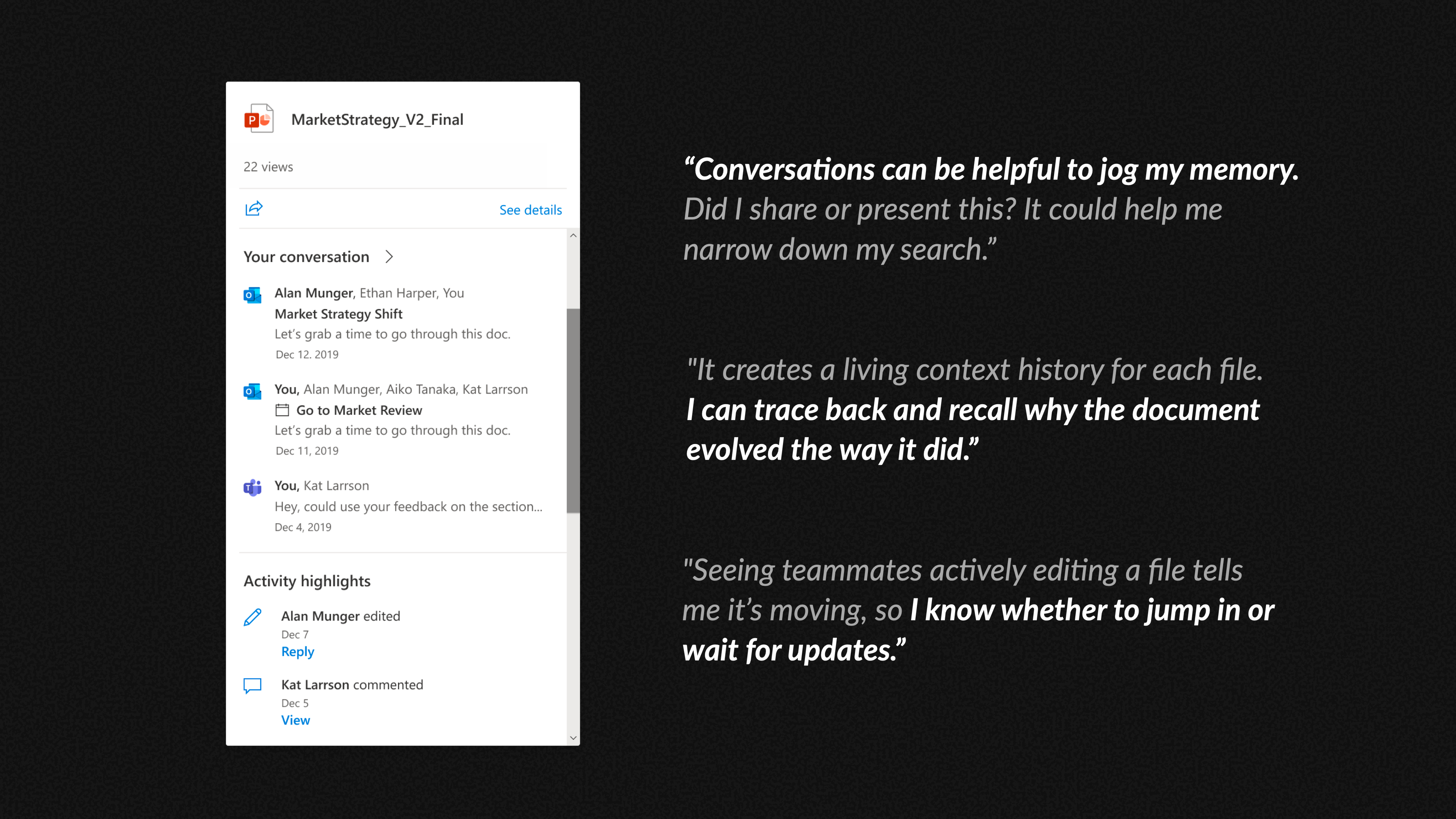
Surface file insights instantly to support your workflows. Eliminating unnecessary file opens, reducing context switching, and accelerating decision-making.
01
__ What I Did  __
Before and After
02
__  Why I Did It  __

Context

Lacked direction on how to drive user engagement.

The File Hover Card aimed to surface file insights for Microsoft Office files (Word, PowerPoint, Excel) to support user workflows in OneDrive. But early versions struggled.
V1: Low adoption due to narrow focus on file analysis signals.
Pre-defined solution: Created by a newly formed team, driven by assumptions, not user needs. It failed internal testing.
I joined midway through when the path forward was ambiguous.
Team
Designer x 1
PM x 2
Engineering team x 1
Researcher x 1  
(was brought in later

Timeline
Joined in April 2019
Feature release in January 2020

My Goals

Clarifying User Value, Strategically Onboarding UX-Novice Teams

I aimed to clarify which file insights delivered true value in the user's context and guide the team from a trial-and-error approach to a user-centered foundation.
03
__  Unfold the problem  __

User Painpoints

Opening unnecessary files and chasing down scattered information slows workflow.

Recall a past file: Kat can’t find the right version of an old file. She’s forced to open each one.
Explore a new file: Monica drowns in search results with unclear relevance.
Track a recent file:  Alan juggles multiple reports and wants to know the status context. He must repeatedly open files and switch between apps just to piece together a snapshot of each file.

Why is V1 unable to engage users?

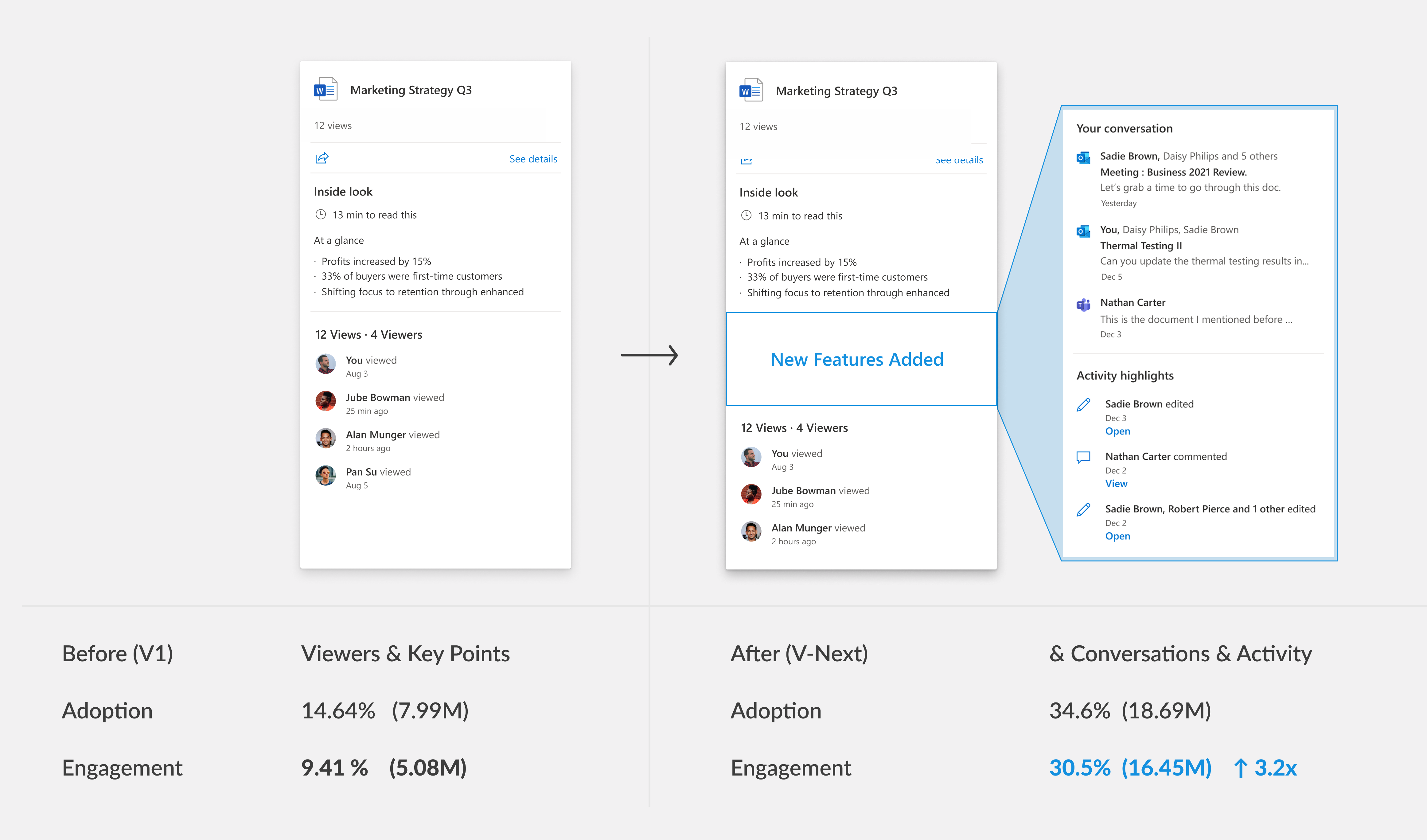
Focus on File Analysis Signals narrowed the user value

File Summery and Viewers are included in V1.  However, after reviewing previous File Card user studies, I found that the initial V1 approach focused on making file analysis signals useful in the hover card. This led to narrow use cases ultimately limiting the user value we could deliver.
Emails : Opening 52 emails to download, upload, and manually organize files.

Design Goal

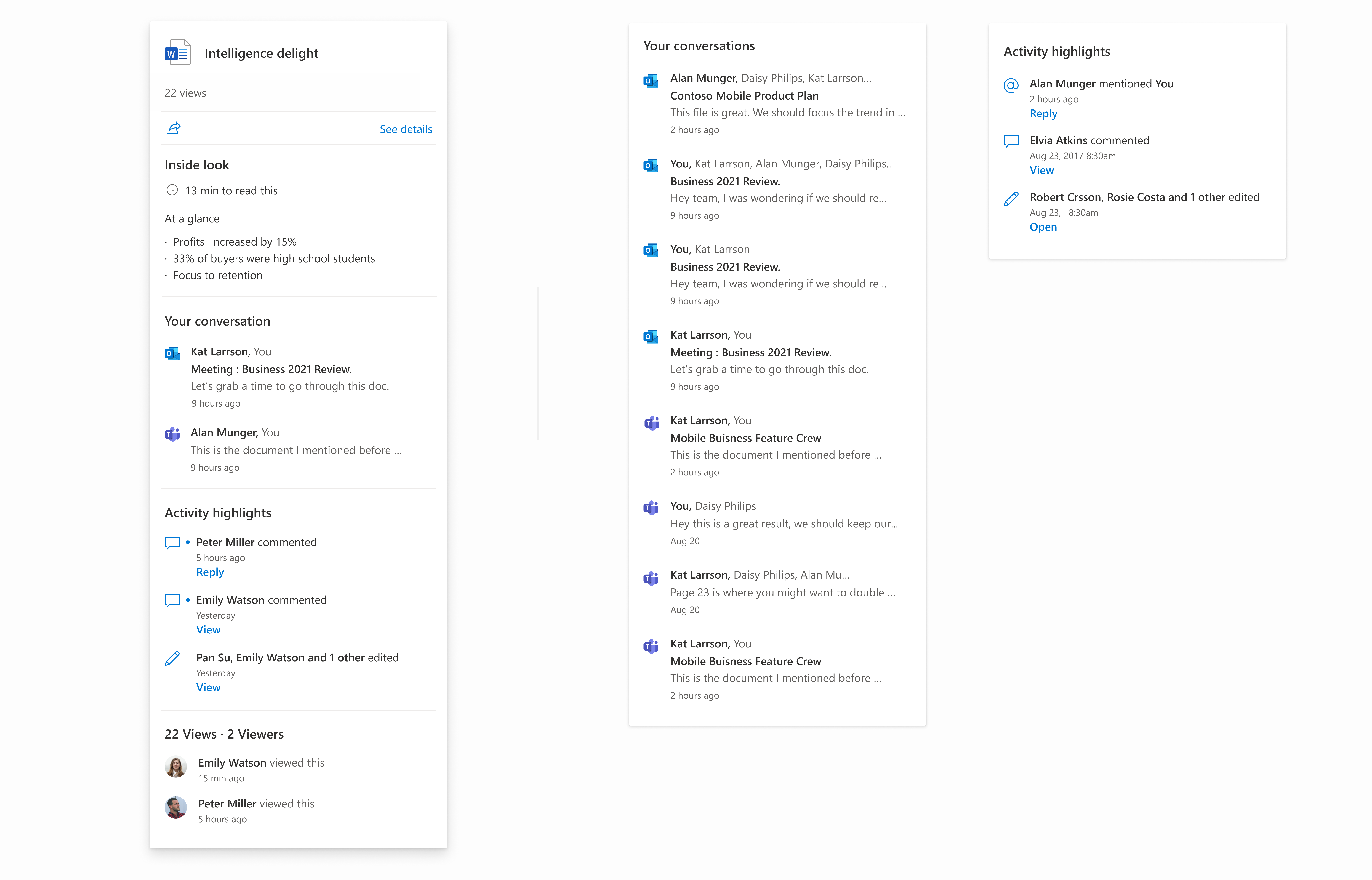
Surface the "right" file insights upfront to help users quickly make informed decisions

Broaden User Scenarios

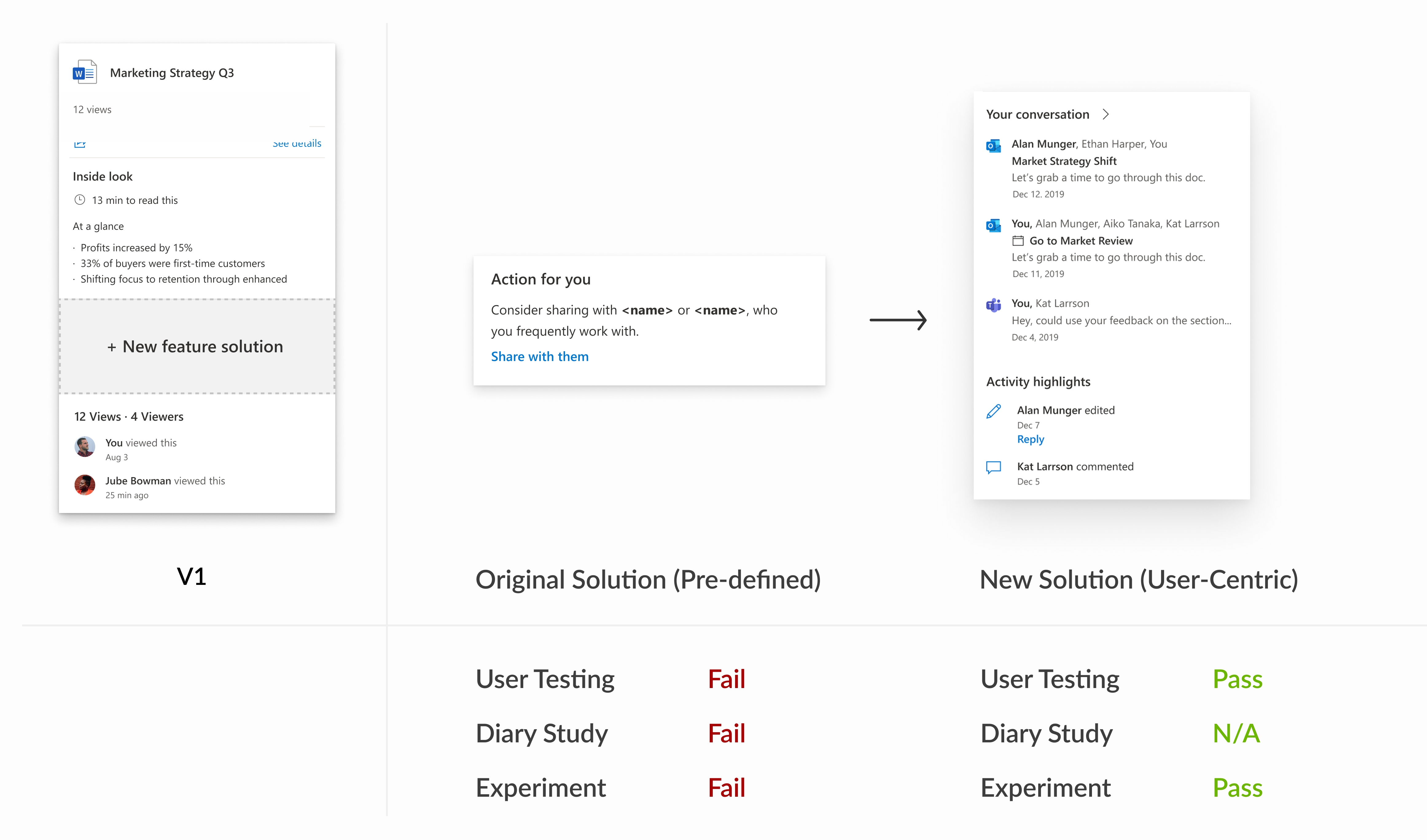
Shift from Feature-Centric to Scenario-Centric

Situation: Misalignment on the Value of UX

Predefined features were prioritized over addressing known UX gaps

While I saw strong potential for File Hover Card features to drive user value and engagement, moving forward was challenging. The team was set on quickly shipping a "suggested sharing" feature as File Card V2 within a tight timeline, despite known UX issues and emerging opportunities. To navigate this, I created a shared File Card V-Next evolution plan to shift the focus from immediate misalignment to future collaboration.
04
__  Design Strategy  __

Led Collaborative Design Session

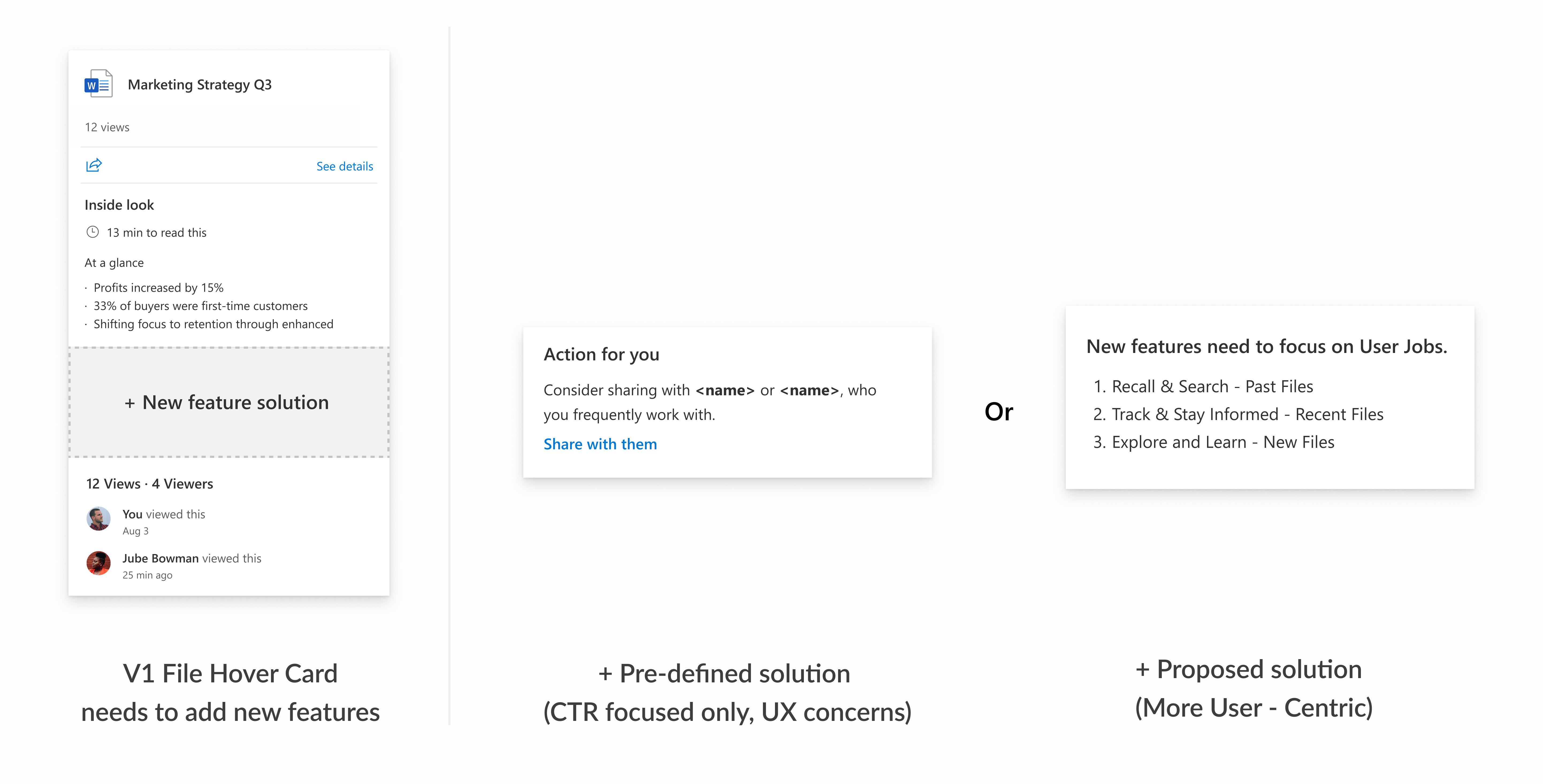
User Focused Ideation on V-Next features

Growing Cross-Org Partnership

Coherent Info Card experience across Microsoft

Socializing Design

Gathering interest in host-adaptive opportunities

Learning from the People Card team's success in driving business impact through integration across Microsoft apps, I proposed how the File Hover Card could enhance users’ daily workflows in products like Outlook and Teams. This sparked their interest in joint design.

Result

Secured Leadership Funding for a UX Researcher and User Study

With a clear future feature plan and growing cross-org interest, we secured leadership support and funding for a dedicated researcher to validate the proposed V-Next features.
05
__   Test and Learn  __

From Hypothesis to Validation

Card Sorting and Interviews

In this card sorting and interview user study, our goal is to test feature proposals, validate user scenarios, and collect direct user feedback. The process moves us from assumption to validation.

Finding Pattern

For the next release, we prioritized “Conversation” and “Activity Highlight” to drive engagement, as they scored highest and addressed key user needs overlooked in V1. The study also revealed diverse scenario-based needs, which led me to further clarify user patterns and typical information needs. This informed our vision of an intelligent File Hover Card that surfaces personalized, context-relevant content.

Refined Approach Backed by Testing & Experiement

Although initial research indicated that "Action for You" wouldn’t meet user needs, we conducted an internal experiment with both solutions to gather more data. The results confirmed that the team should pivot to the new solution.
06
____  Impact  __

From a Patch to a Path

When the pre-defined solution failed, the framework we developed enabled the team to pivot quickly and deliver the new File Hover Card. It launched in the OneDrive for Business "My Files" view, introducing Conversation and Activity features. Six months later, the succeeding product team adopted the same design framework to successfully launch the Related Files feature.